How to Mix Pantone Colors for Spring/Summer 2022 into Your Interior Décor
Each year, the design world waits with bated breath for the Pantone Color of the Year. But just as important is the global authority's color trend prediction for Spring and Summer. These are the colors you're likely to see everywhere in 2022, including interior design. If you're looking to freshen up your home's color palette with hues that are trendy and timeless, these lovely colors will not disappoint. The colors below are part of the Core Classics and are versatile, timeless, and well-suited to Florida interior design.
According to the experts at the Pantone Color Institute, the colors chosen for Spring/Summer 2022 reflect our aspiration for balance as we navigate a new landscape. These colors reflect the sentiments of clarity, simplicity, and comfort, as well as the desire to stay with the familiar.
The Core Classics are the best evidence that neutral colors are anything but boring. They may lack the brashness of bold hues, but they make up for it in the finesse and elegance they offer in almost any space they appear. Pantone's Core Classics include a pale grey, a deeper gray, sandy beige, and white. These Zen-like colors drawn from nature create a warm, cozy, and inviting feel that will stay fresh and fashionable for years to come.

Snow White for Simplicity and Inner Peace
No list of timeless, classic colors can be considered complete without a shade of white, so yes, we're going there. Snow White is a clean, clarifying minimalist hue that cuts through the mental clutter and brings in a sense of tranquility.
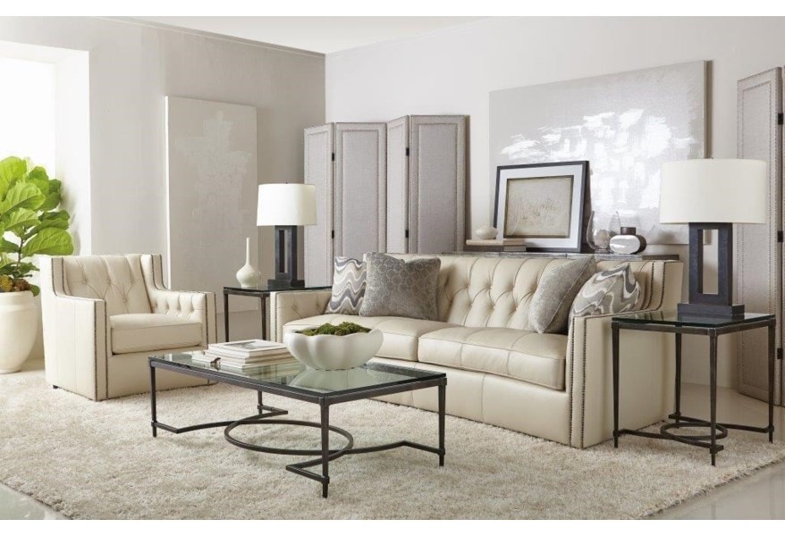
Satisfy your desire for serenity and simplicity by painting the walls white and hanging pristine white curtains or sheers to add softness to the space while letting the bright, natural light stream through. A soft shag rug on the floor adds sophisticated, alluring charm to the living room. Use a glass-topped coffee table for a contemporary touch.
The curved Bernhardt Candace Sofa with Transitional Elegance brings this color palette to life. The combination of traditional elements with sleek contemporary lines creates a unique and elegant look worthy of Snow White.

Perfectly Pale Invokes a Warm, Comforting Beach
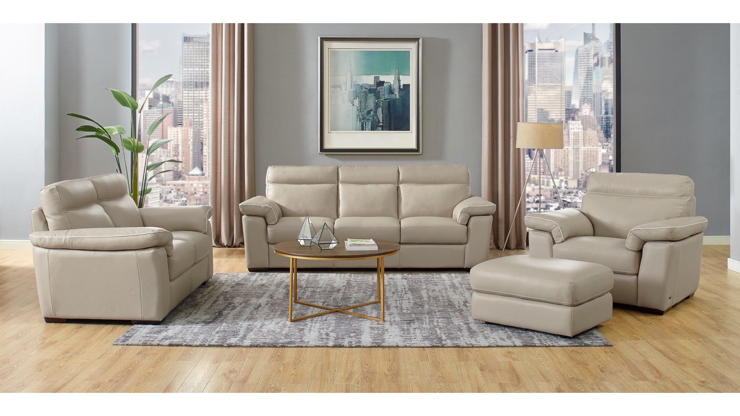
A soft sandy beige, Perfectly Pale will remind you of a warm, inviting, soothing beach. Infuse your interior design with the popular neutral to evoke a comforting feeling of warmth and radiance. This color is guaranteed to bring life to a dull and gloomy space.
Drape beige linen curtains in your living to underline the welcoming aura, sprinkle the space with pale driftwood accessories, natural sand decorations, or geometric glass shapes. The sandy-colored Natuzzi Editions Brivido Contemporary Power Reclining Sofa with Legs will satisfy your cravings for a tranquil, calm ambiance that is high-style based in a classic neutral. The recliner relaxes your body while the Perfectly Pale color relaxes your soul.

Northern Droplet Instills Tranquility
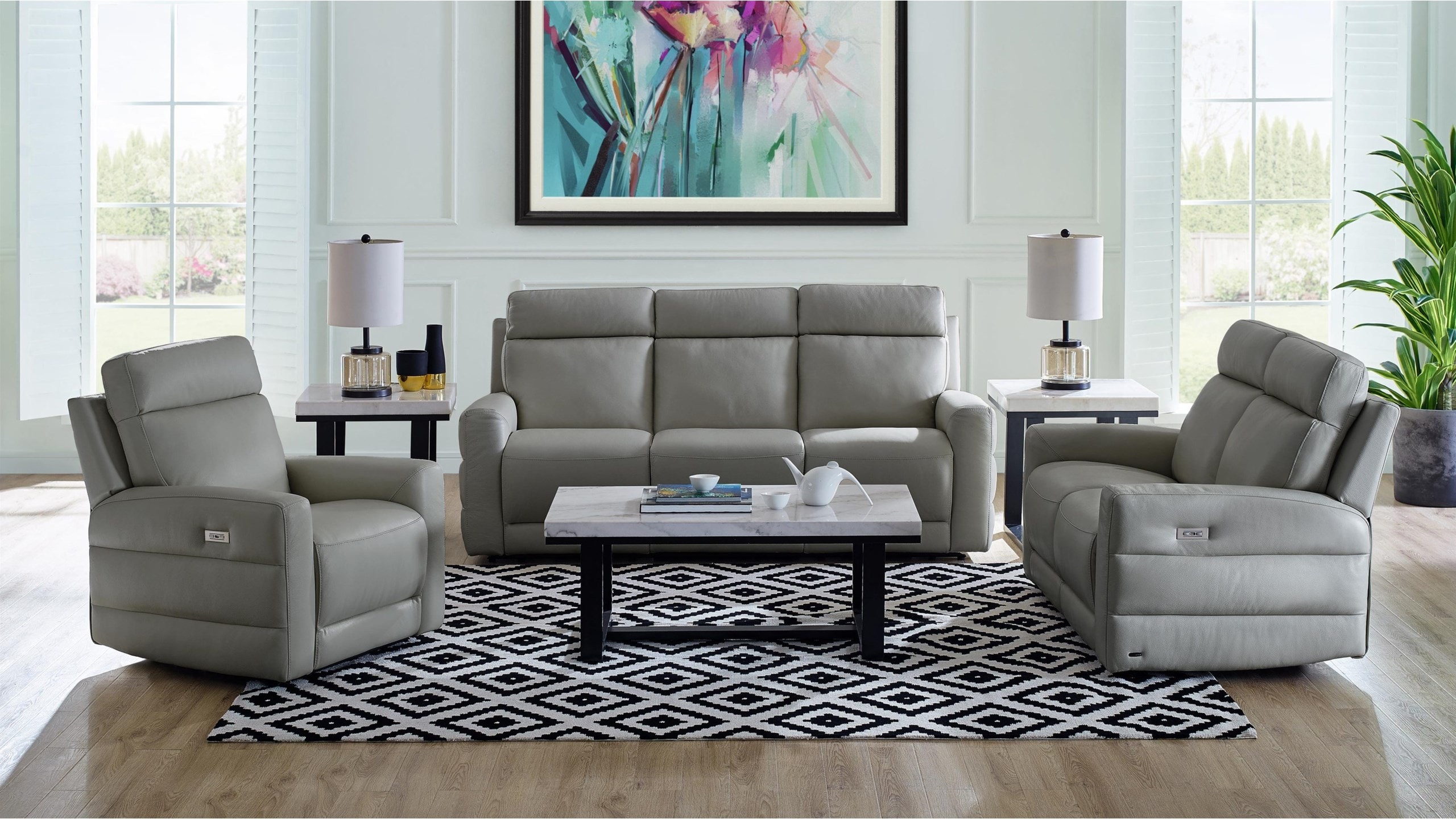
A subtle shade of gray, Northern Droplet evokes a tranquil sense of wellbeing. The enticing gray color is easy to work with and gives you plenty of options. Keep the entire room neutral, or add some color, depending on your preference. Ground the space with a bold geometric print rug. Or use this color in every element and add appealing elements such as gray planters, concrete planters, and gray flowers.
The Natuzzi Editions Benevolo Leather Power Reclining Loveseat offers comfort and ease. Keep the windows bare to let plenty of the Florida sunshine inside as the Northern Droplet emanates a sense of positivity and calm.

Poppy Seed Offers Timeless Familiarity
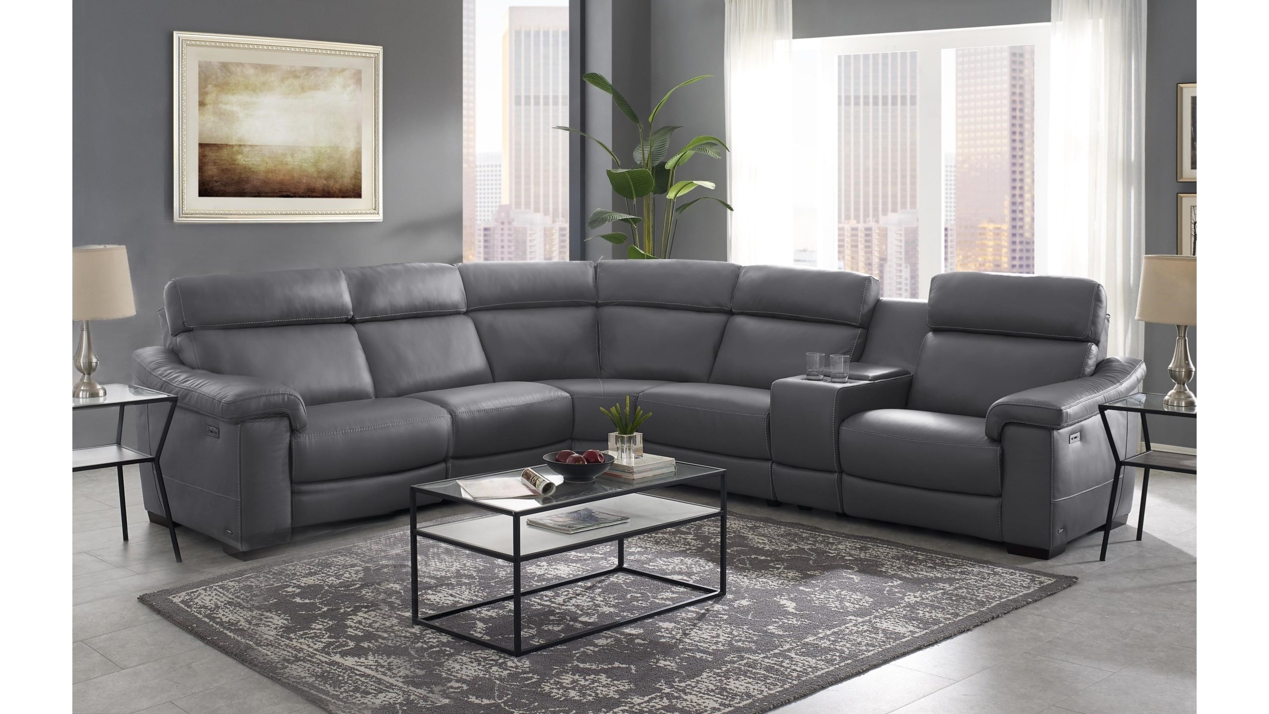
If you prefer a deeper shade of gray, the silent power of Poppy Seed's timeless familiarity will bring you peace of mind. Its aesthetic instills confidence that is free from the constricting boundaries of seasons. Introduce this color into your interior décor subtly with curtains, pillows, tablescape décor accessories, and wall accents. Or, choose a bold path with the Natuzzi Editions Giulivo Power Reclining Leather Sectional Sofa. It fits in with this vibe as it conveys a message of strength and power.
A final note: don't be afraid to experiment. Pantone's color palettes can easily be mixed into your current décor by adding accessories or a coat of paint. They form a backdrop against which you can switch out bright colors when you want to revitalize and invigorate your living room or tone it down by mixing and matching the neutrals to create a relaxing and restful bedroom.
Visit the Baer's Furniture location near you to speak with one of our in-house design professionals about how you can blend the Pantone Spring/Summer Cor Classics into your décor.
Florida Inspired Living Archives
April 2022

